
Background
Education.com had an existing app on the tablet that was hard to maintain, so they updated their strategy relaunch a native app that both tablet and phones could run to provide ongoing value for Premium customers. This learning app would be called Brainzy, which helps kids from Preschool to 2nd graders play and learn at the same time.
The internal team also saw this as an opportunity to evolve the visual brand and aesthetics of Education.com’s learning app closer to their vision of the kid-facing experience.
UX Designer
Team: Product Manager, Design Lead, 5 Engineers
I contributed to brand vision, marketing pages, user interface. As the only illustrator available regularly for the team, I also helped with creating logo, app store icon, and illustrations.
Role
➡️Give the mobile app brand aesthetics that speak to Preschoolers - 2nd Graders
➡️A step toward the holistic vision of the kid-facing experience
Goals
🎉Allowed launch of the mobile app with a cohesive brand
💪Improved team confidence on the overall vision of the kid-facing experience
✨Positive feedback from customers
Results
As part of the brand vision, I created an optimistic logo made for kids in mind.

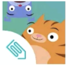
As well as an app store icon that elevated our iconic characters

After
Before
But most importantly, I created:
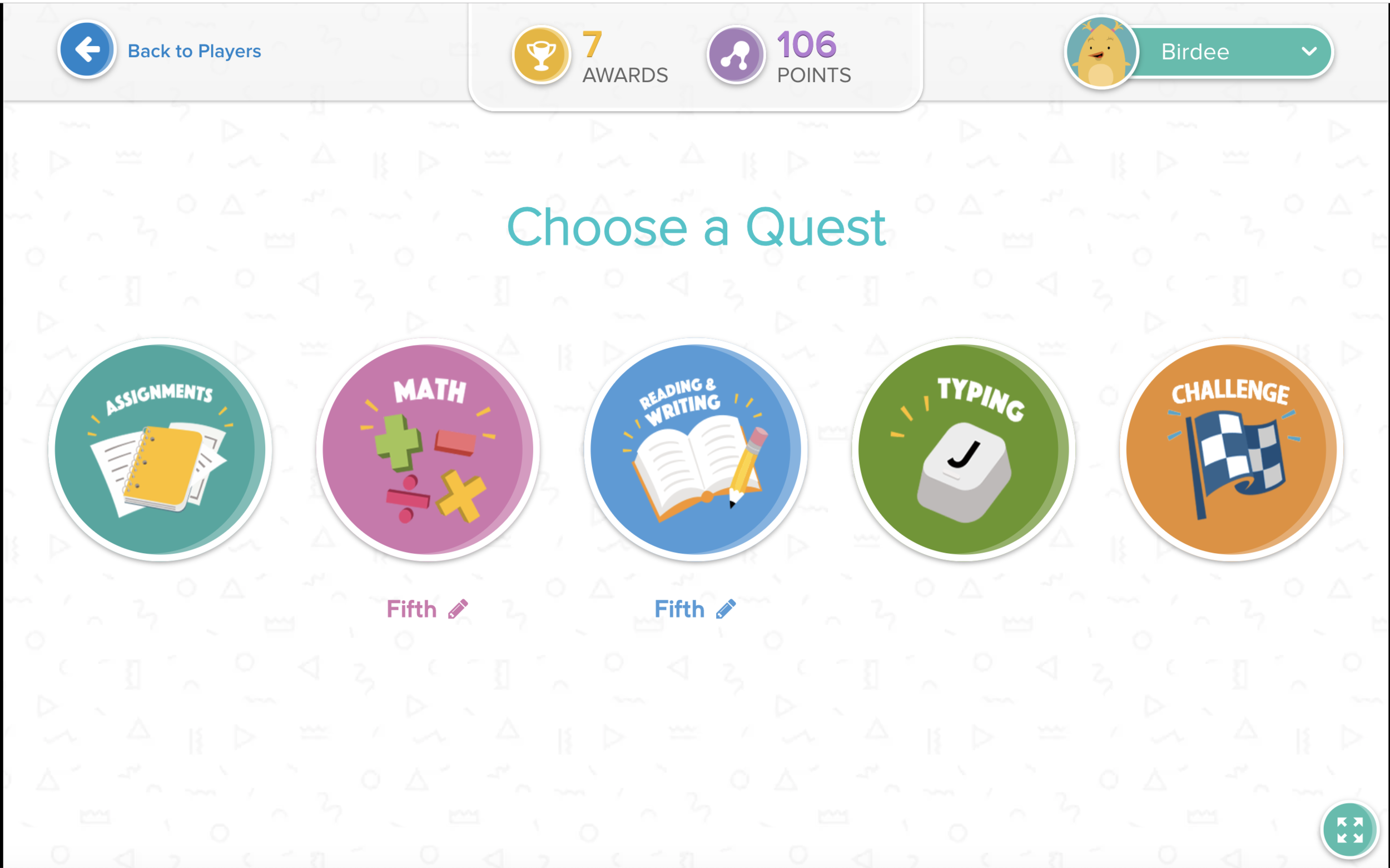
A main menu that invited kids to explore
I collaborated with the lead designer, product manager, and lead engineer to understand their vision of the art direction.
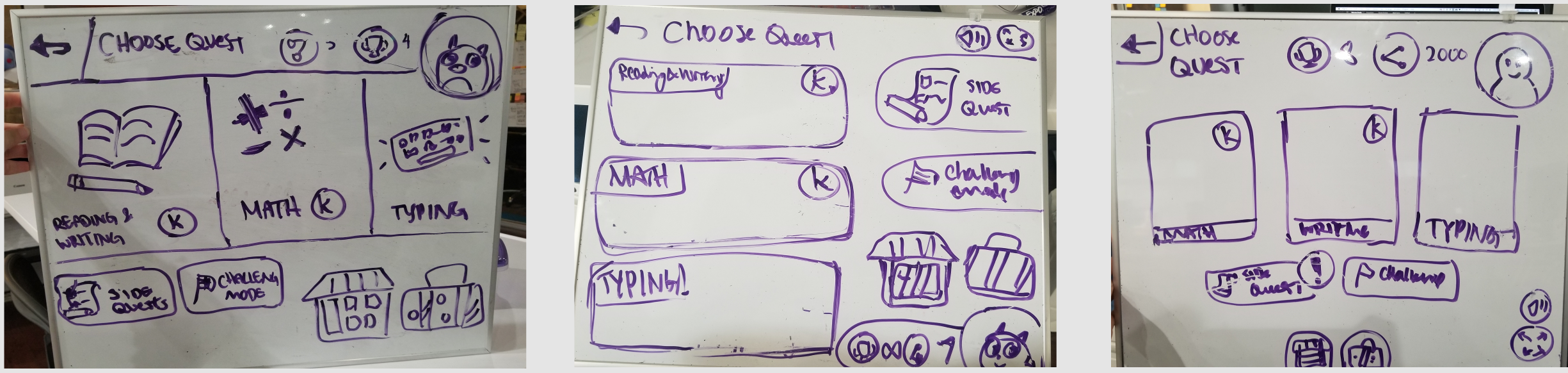
How did we get from here…
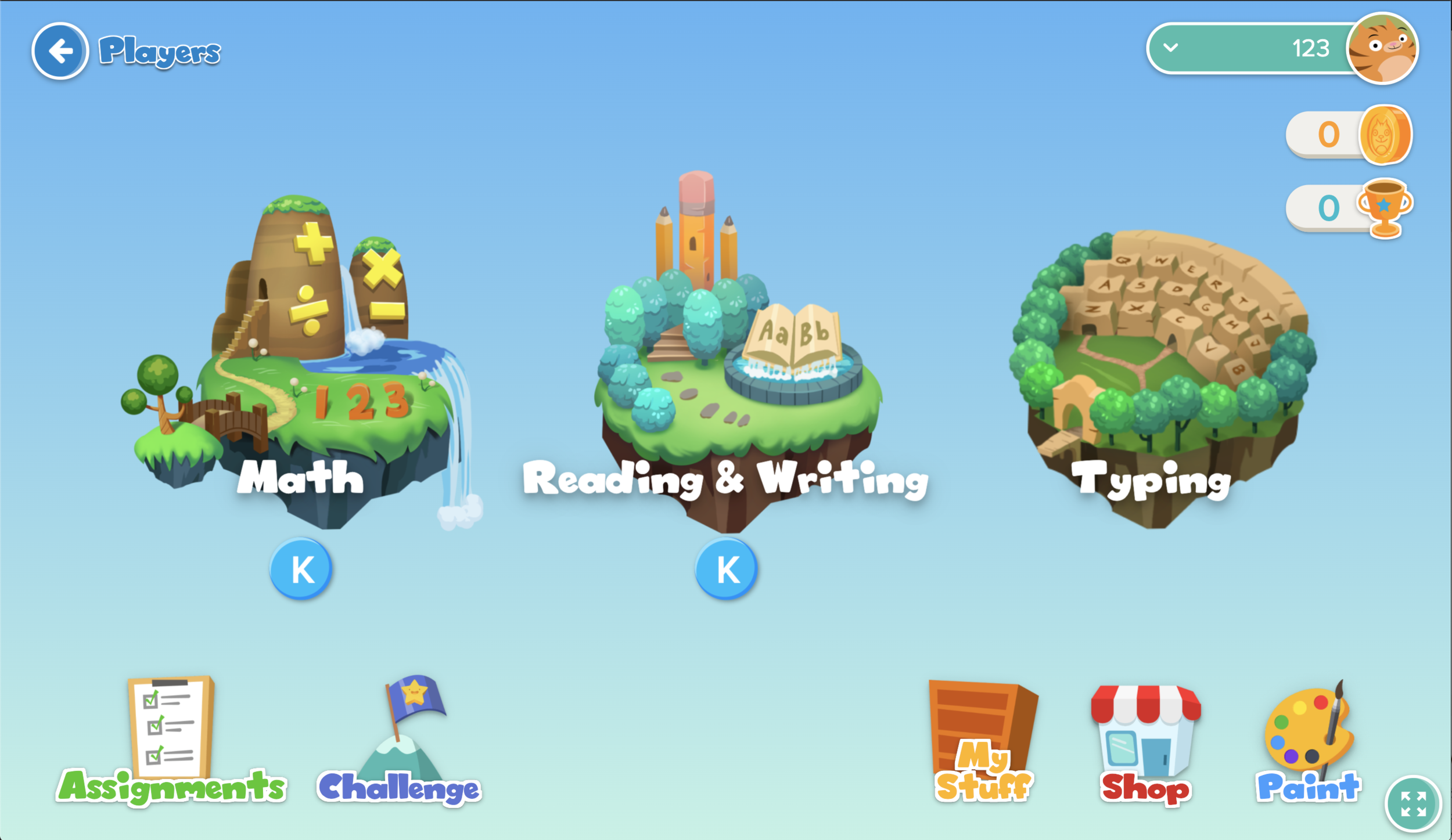
…to here? (Actual screenshot from the Brainzy experience.)
In the meantime, have a sneakpeak to some process images.
Full case study coming soon.🔮
Learnings
Sometimes seeing concepts in high fidelity is the point. Low fidelity is only needed a little.
The importance of speaking to a team’s vision and getting their expectations upfront first