
Background
Education.com wanted to improve the kid-facing experience to create a naturally motivating environment for Preschool to 2nd Graders.
When joining the team, I learned that the kid experience in the existing state was considered disjointed and not in line with the vision that they had. However, with a huge technical hurdles, it was important to prioritize what was actually achievable.
Role: UX Designer
Supported by: Product Manager, Lead Engineer, 3 Software Engineers.
I contribute to user testing, wireframes, prototyping, interface design, and animation.
Result
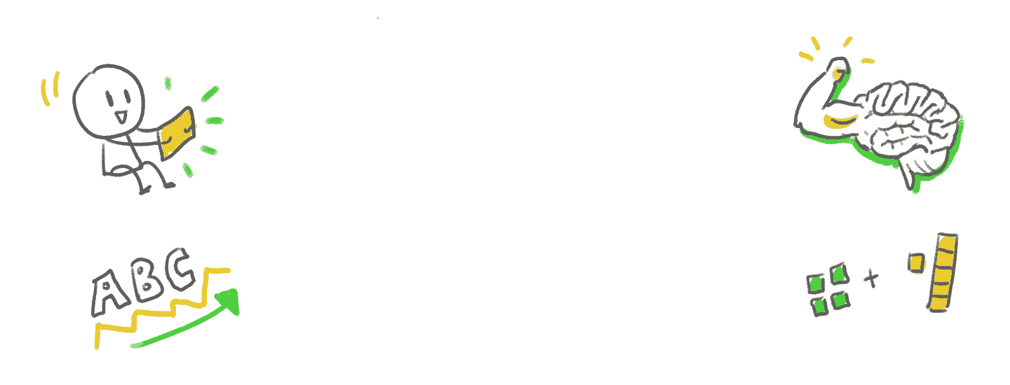
🎉 Increased of average games played per week by 60%
🧠 Increased # of skills learned per week on the Education.com platform
🧒 Better understanding on how to improve the vision of the kid-facing experience
Key challenges
Switch to a new internal team and adapting with new team dynamics
Organizational pain points of integrating the UX research into Agile Scrum
Ideological differences within team members and the organization of how to research, build, and test a product
Learning how to change approach when playtesting with children
Technical limitations on what we could actually do
At first, I relied heavily on the UX processes I first learned in an attempt to do things the “right way".” Something like this…
What I found was that real life in a transitional team with no defined process was closer to this…
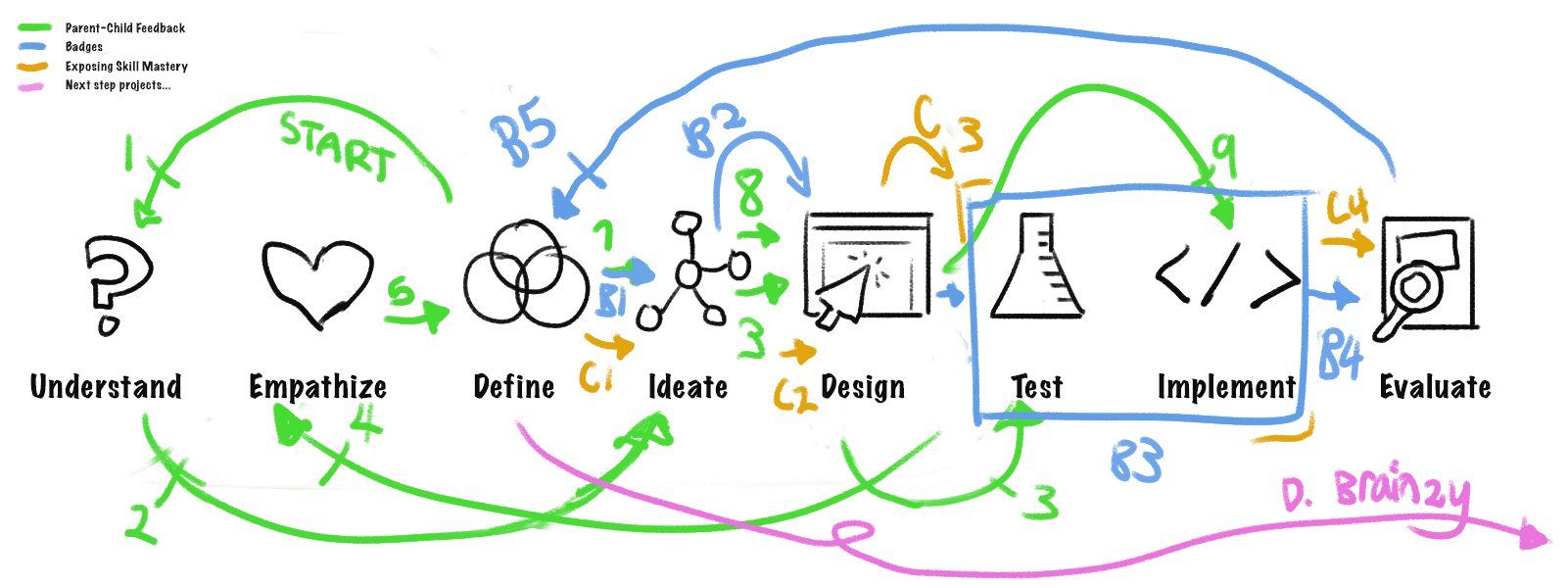
If this looks like a HUGE mess to you, that’s also how it felt for me at the time!
Although confusing at first, I’m now very grateful that I was able to have my assumptions and preconceived notions challenged. :)
Gathering context about the problems
We started off with a team kickoff about the problems we were trying to solve. That was helpful because this was my first time closely working with these specific team members.
🧒 Customer Problem
Evidence of skill mastery was not clearly visible, meaning there was less confidence from guardians and children in the effectiveness of our platform.
In addition, games didn’t do enough to celebrate when kids were learning skills, leading to less motivation to build a habit of learning.
🧳 Business Problem
Kids would bounce from the lesson based experience very quickly, leading to low engagement. Many opted to interact on the one-off detail pages for individual games.
We defined our overarching goals...
➡️ Create a naturally encouraging environment to play and learn skills that they're struggling with
➡️ Improve learning outcomes that the games provide
➡️ Gain a better understanding about what is motivating and habit-forming about digital learning games for young kids
Research from many angles sets a solid foundation
In the beginning stages, I had access to different kinds of research to inform my understanding of parents and children.
Competitive analysis done by myself with help from team members
Parent personas created by internal UX Researcher
Insights from a massive research project done to understand the Education.com games experience with children
Further in this case study, I talk about testing done to validate solutions and assumptions at later stages of the project.
1. Competitive analysis let us know what was missing
I looked at several educational services that targeted the similar age range or Preschool to 2nd Grade: Prodigy, ABCMouse, Khan Academy Kids, and Basic Spelling Tricks. As a team, we also looked at other non-educational games such as Animal Crossing to see what they did well.
I found it interesting that out of the 4 educational games, only Prodigy included rewards from a guardian on their platform. After talking to researchers and parents, I realized that motivation from parents is extremely important when it comes to a child learning.
After going over all the games, I concluded opportunities for the Education.com kid-facing experience:
- Having a bigger purpose in the context of the learning world
- More exploration and sense of agency
- Interaction loop between parent and child (setting goals, providing feedback)
- Feeling of “belonging”
2. Personas as a shared resource
At Education.com, a UX Researcher created personas for different types of parents, so I leaned into them as references instead of creating my own. For this project, I kept the”Edutainment” persona in mind for the parent.
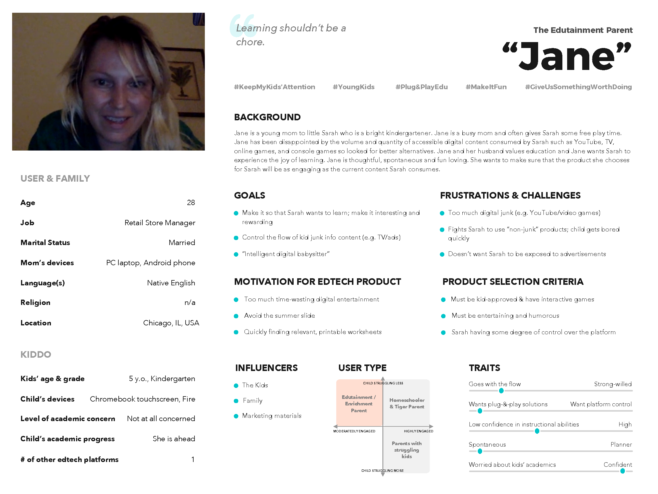
Created by an internal UX Researcher at Education.com.
The “Edutainment” parent focuses on making learning rewarding and interesting while also prioritizing convenience and ease-of-use in their daily lives. They don’t want their children children spend too much time on digital entertainment, but also don’t want to fight to get their children to do something the parent deems more productive.
3. Insights from a research project helped me understand children
I also had access to recent findings from research done on understanding the Education.com game experience that was not conducted by my team. That project was done by the Lead UX Researcher and Head of Curriculum in consultation with an external researcher Elliot Hedman.
The key insights that I pulled:
Just Right Challenge
Digital Teaching is Ineffective
Interfaces Must Be Intuitive
Sticky Stories
Strong Game Framework
The research team also strongly recommended next steps for our team, which involved wanting to revamp our entire game ecosystem. That gave us our next big challenge.
Cutting scope due to feasibility = tough pill to swallow
However, with the current limitations of the technology of the kid-facing experience, engineers on our team couldn’t revamp the entire architecture without spending months of massive effort.
The PM and Lead Engineer finalized the decision to tackle smaller risk issues first. Do small experiments to prove it works, then start chipping away at bigger issues later on.
I have to admit: It was hard for me to accept that after all that research, I couldn’t do what we really wanted to do and actually give more value to the customers.
Experiment 1: PARENT-CHILD FEEDBACK LOOP
Giving parents an option to send a reward to kids after completing a meaningful activity.
After the competitive analysis of similar learning apps, I sketched out my ideas, and then created a paper prototype to discover what the initial reactions from parents would be.
Questions:What was meaningful enough to parents that would make them want to send a reward?
What type of acknowledgment they would want to send?
What do kids want as rewards that we could actually do?
I interviewed 5 parents at Education.com in other departments to get information about my biggest questions.
Insights from testing with parents
Want details on what was being earned.
Most parents want to see progress on skills. Different parents have different definitions of what was meaningful.
Parents want to know what they're sending to their kid.
A concern that came up was "Is this something that I need to pay for?"
Some want customization. Some don't want too many choices.
Most importantly: Sending a reward/message is meaningful because it helps parents open a conversation with their child about what they're working on.
Convenience.
Not too many reward moments. 1-2x/week. Simple. Fast. Don't want to read too much. It would be great to be notified by email to tell them to come back and do the thing.
Setting goals (out of scope).
Things to send
Stickers of Education.com characters (default), written custom messages, and audio (not implemented).
Observations: Kids would smile or get visibly excited and say that they were happy.
Insights: Seeing their own name was great on their present. It's one of the first things kids learn. :-)
A surprising outcome
We pushed the feature to all Premium customers and tracked how much it was being used and learned the following”
25% of parents who received the option to send a gift did so
Of that number, about 90% sent a custom message
As a result of initial tests, we assumed that few parents would take the time to do that. I was happy to be proved wrong!
Experiment: BADGES
Rewarding kids with a badge after completing an online lesson
Badges by itself were not very engaging.
Kids asked for something to do, like play characters or purchase fun items.
Experiment: EXPOSING SKILL MASTERY
How would we show skill progression in a way that was meaningful?
Moments to show skills
Main map
In the Guided Lesson
End of game
The discussion as a result from the product and technical side, we decided that showing it at the end of the came would be the most effective.
After the design, I worked with an engineer to make it work on the website and the PM worked out an A/B test. The result of the test was that showing the mastery bar increased average games played by ~60%.
Learnings
Kids want to learn if they’re challenged in their appropriate zone of proximal development, learning experiences that aren’t too advanced and yet challenges them sufficiently.
Often, the full 5-step design thinking process isn’t realistic or needed to get results, especially at a startup.
When dealing with challenges between balance team needs and the role of the user experience designer, it’s important to be flexible and meet the team with where they are at.
Building team trust is the foundation to getting everything else done, from prioritization to development.
💪
This case study is in progress at the moment!
Contact me directly if you’d like me to talk more about it.