
Background
The sign up flow on the Credit Sesame mobile apps on the Android and iOS platform was implemented by developers when the mobile app was created. This was before there was a Sign Up Team (which I was hired to be on), so there wasn’t a push for an intentional experience.
As a result, the experience looked very different than the rest of the app. Additionally, there wasn’t any guidance on how to design for the Sign Up Flow.
Role: Product Designer
Platform: Android, iOS
Team:
1 Product Designer
1 Product Manager
3 Engineers
Overseas QA Team
Results
Outperformed the control by 16% Android and 8% on iOS
Design stakeholders were happy about improved craft in an area that was considered neglected
Developer stakeholders were happy about being involved with component conversations
Problem
Since I was the only designer for Sign Up flow, I would have to hunt down files to find the interface. We were also transitioning to Figma from Sketch. All the existing files that had the sign up screens were in Sketch.
So, since the sign up funnel used drastically different UI, I basically had to recreate everything from scratch. This was a time sink.
We already had existing form fields for desktop web and mobile web. I wanted to try to use consistent components in the sign up funnel for my own benefit, but I also found so much more…
Form fields are super complex!
Through my conversations with developers across the web, Android, and iOS platforms, I found out these things:
There were so many different form fields in the mobile apps, differently styled across Android and iOs. Basically every form field in the app was created as a new component.
The sign up funnel was basically created as a last minute thing when the mobile app was pushed out.
What to do?
Android would start to bring in the form components from Google Material library into the sign up funnel.
iOS would develop things by scratch
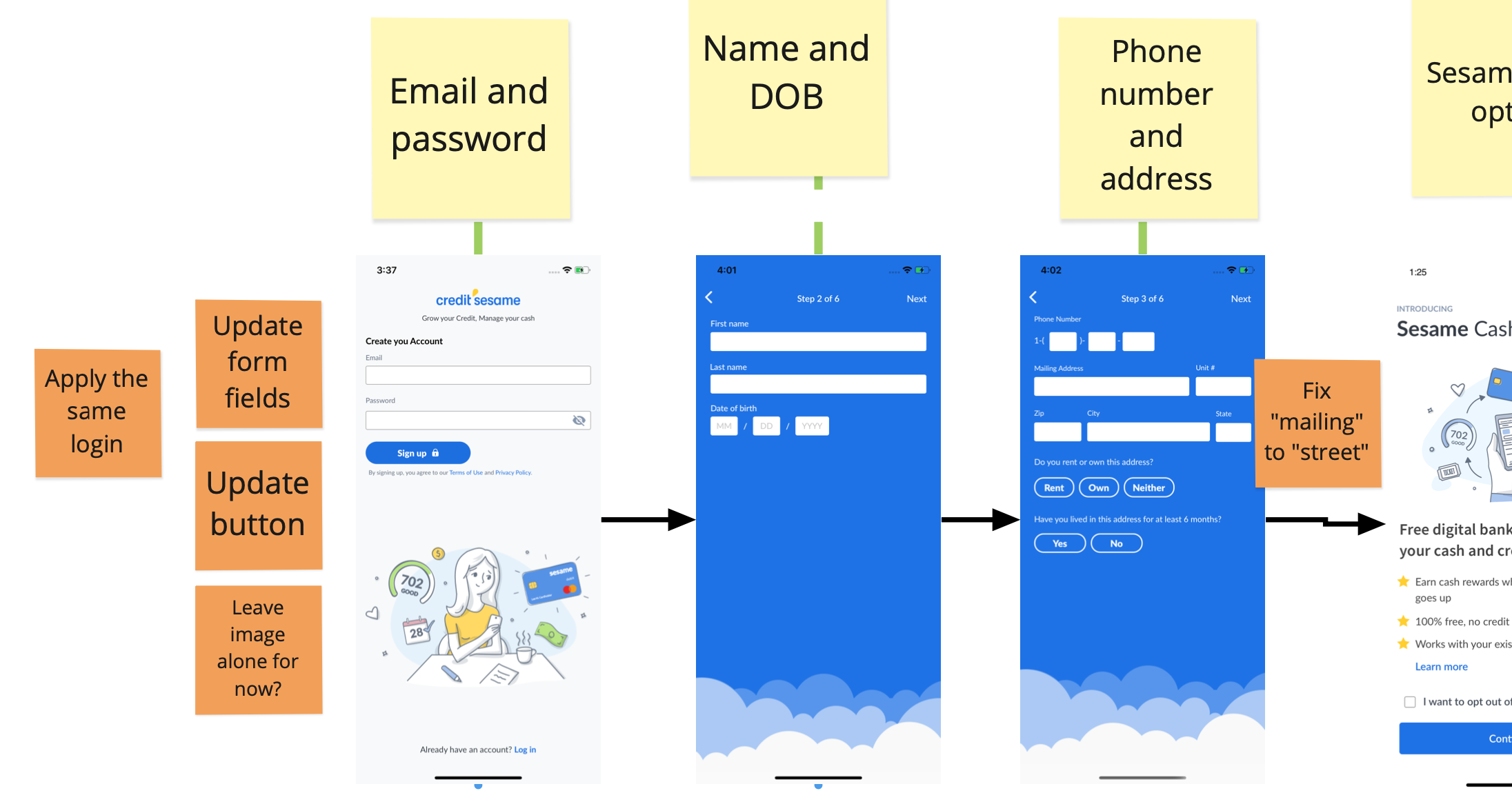
Sample of BEFORE
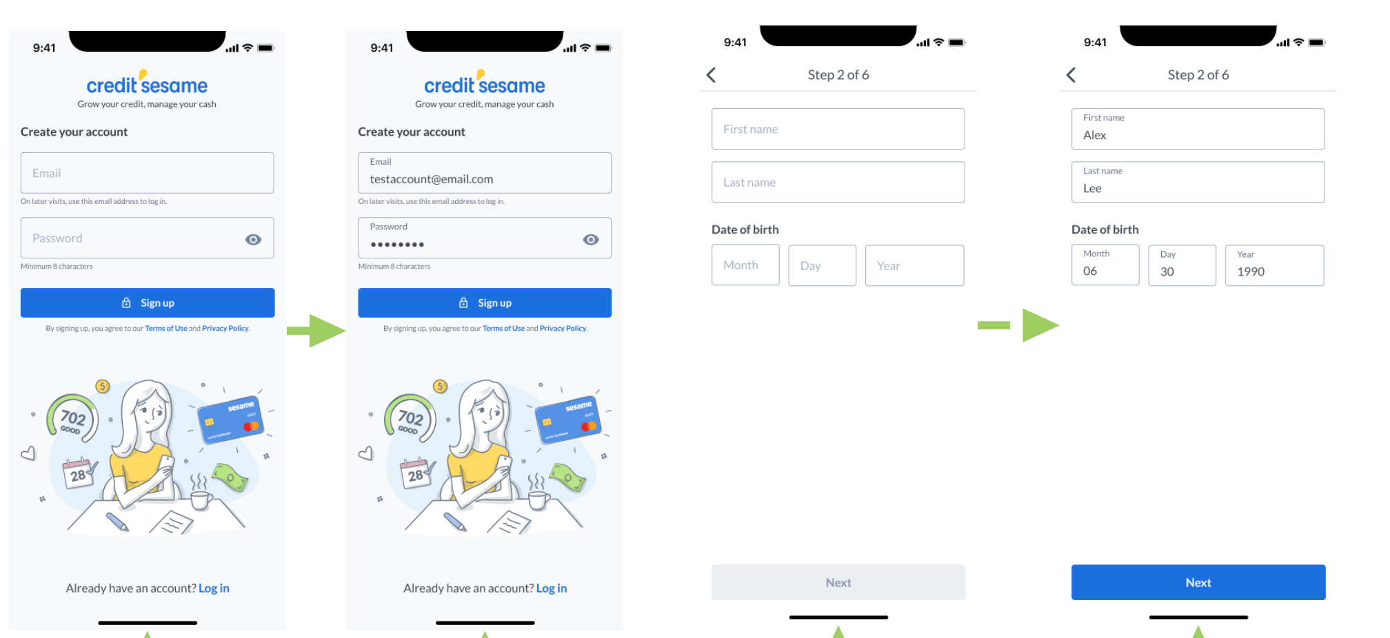
Sample of AFTER.
Sample of the components I personally worked on
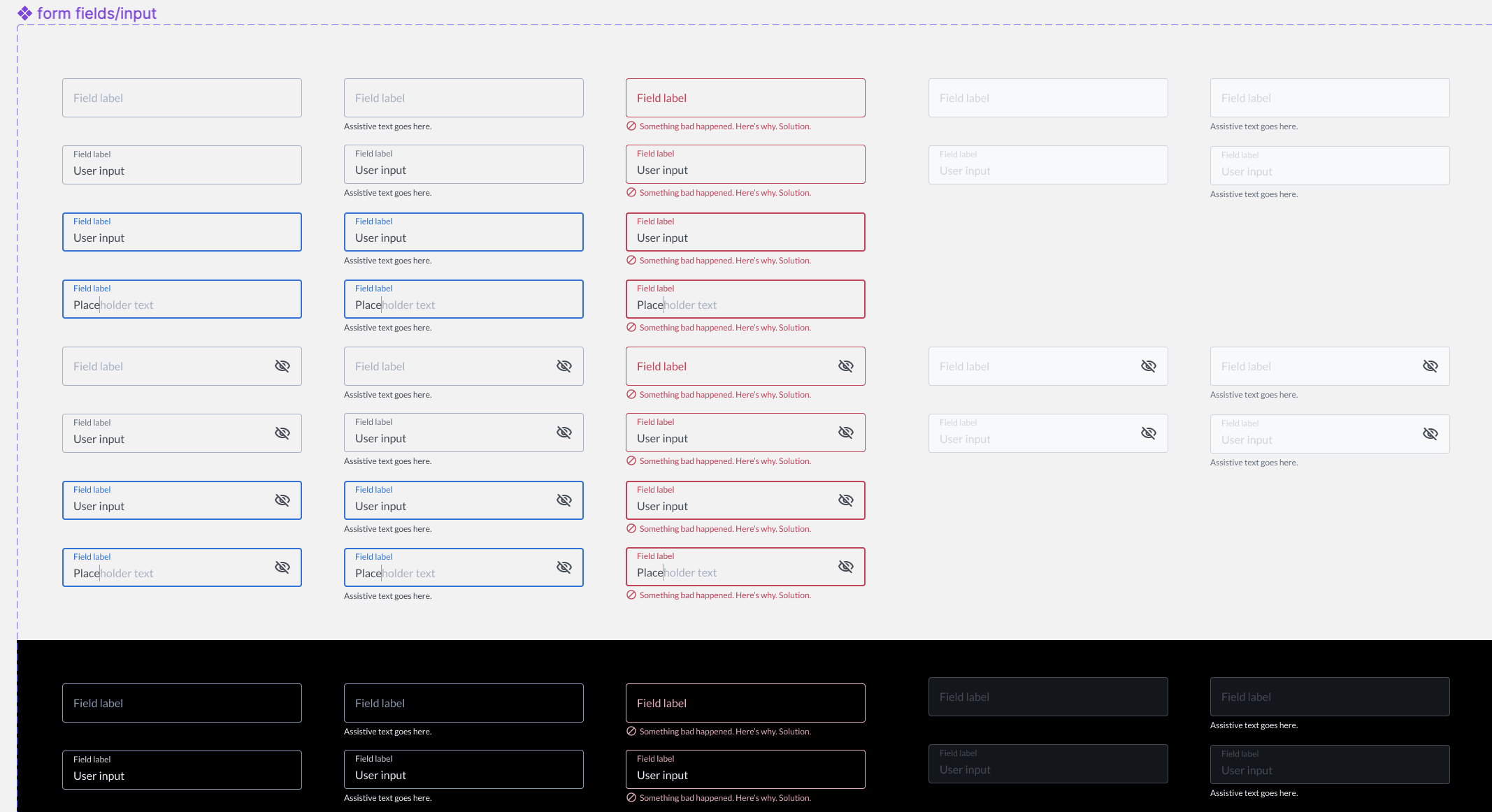
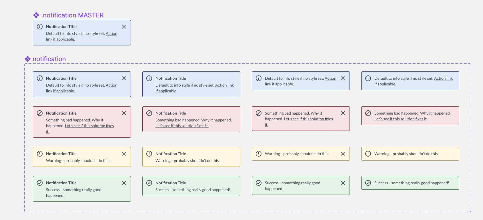
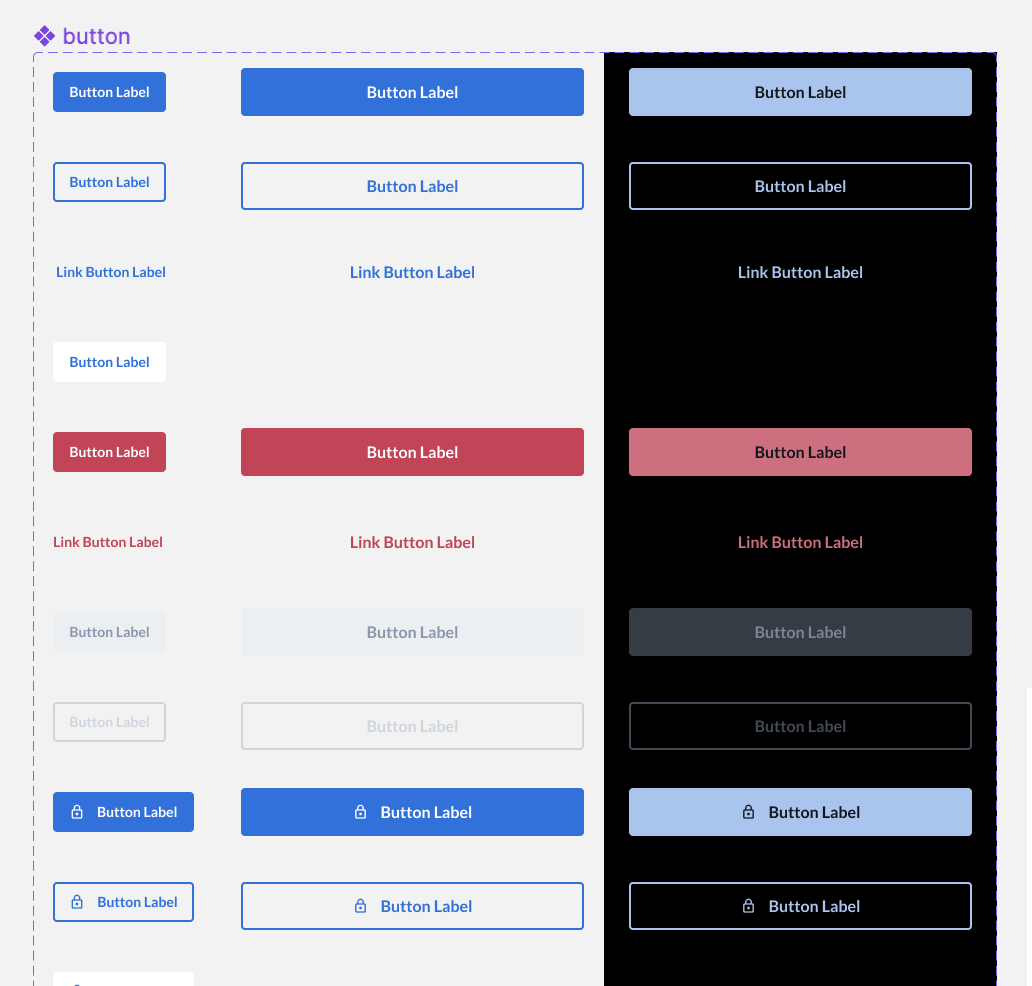
It was a lot of fun work because the form field, notification, button were some of the most common components used in the whole app, not just in the Sign Up Funnel.
Lessons Learned
Form fields are surprisingly complex. Therefore, shared libraries are amazing.
There is always at least one developer who cares about component consistency. Finding that person is sooo important for me.
Timing is important. Sometimes