
Background
In 2020, Credit Sesame started their first UI kit in Sketch, but not all designers were using the most updated library. Our team was quickly growing and we needed to find a way to maintain consistency. We decided to switch to Figma due to its cloud based feature and started an initiative to build a design system.
Our ultimate goal was create a component library for developers. We wanted to link components in Zeplin so that developers can trace it back to the source code, making it more efficient for the whole team to build the product.
Team:
4 Product Designers
1 Product Manager
3 Engineers
Role: Product Designer
Platform: Desktop & mobile web, Android, iOS
Results
Brought 40+ components from Sketch to Figma
Clear documentation for designers and developers to understand how to use Dark Mode
Upgraded commonly used components with Dark Mode variant
Unified disjointed Dark Mode palette into a cohesive palette
Increased trust in the design system
Co-created a process to maintain and contribute to the design system with developers and designers
Problems
No ongoing ownership of the design system as the designer who created original documentation was no longer at the company
No ongoing dialogue between teams to stay on the same page on how to use different components
Developers didn’t have unified approach to Dark Mode, which led to too many colors and repeated color tokens
Dark Mode, you’re a mess but we love you anyway.
Dark Mode was a push before my time that wasn’t prioritized as a design effort, but something to get out the door.
The legacy dark mode palette included 5 colors, but in the app, I found lots of different colors used for components that were not part of the 5 colors.
Additionally, the existing Credit Sesame palette had a Neutral palette (separate from Dark Mode) that did not account for the darker range of greys. So if a designer needed a color that wasn’t part of the Neutral or existing Dark Mode palette, they would choose an entirely new one. This resulted in a lot of different greys.
Additionally, when developers saw mockups on the Zeplin that designers uploaded, depending on the developer time, they would either look into existing color tokens or just create a new token. This lead to a lot of redundant tokens.
What I did to create a source of truth:
Depreciated the legacy “Dark mode” palette entirely and Added new 4 colors to our range of Neutral colors suitable to Dark Mode
Created a guide for Light Mode and Dark Mode pairings for text and most common components
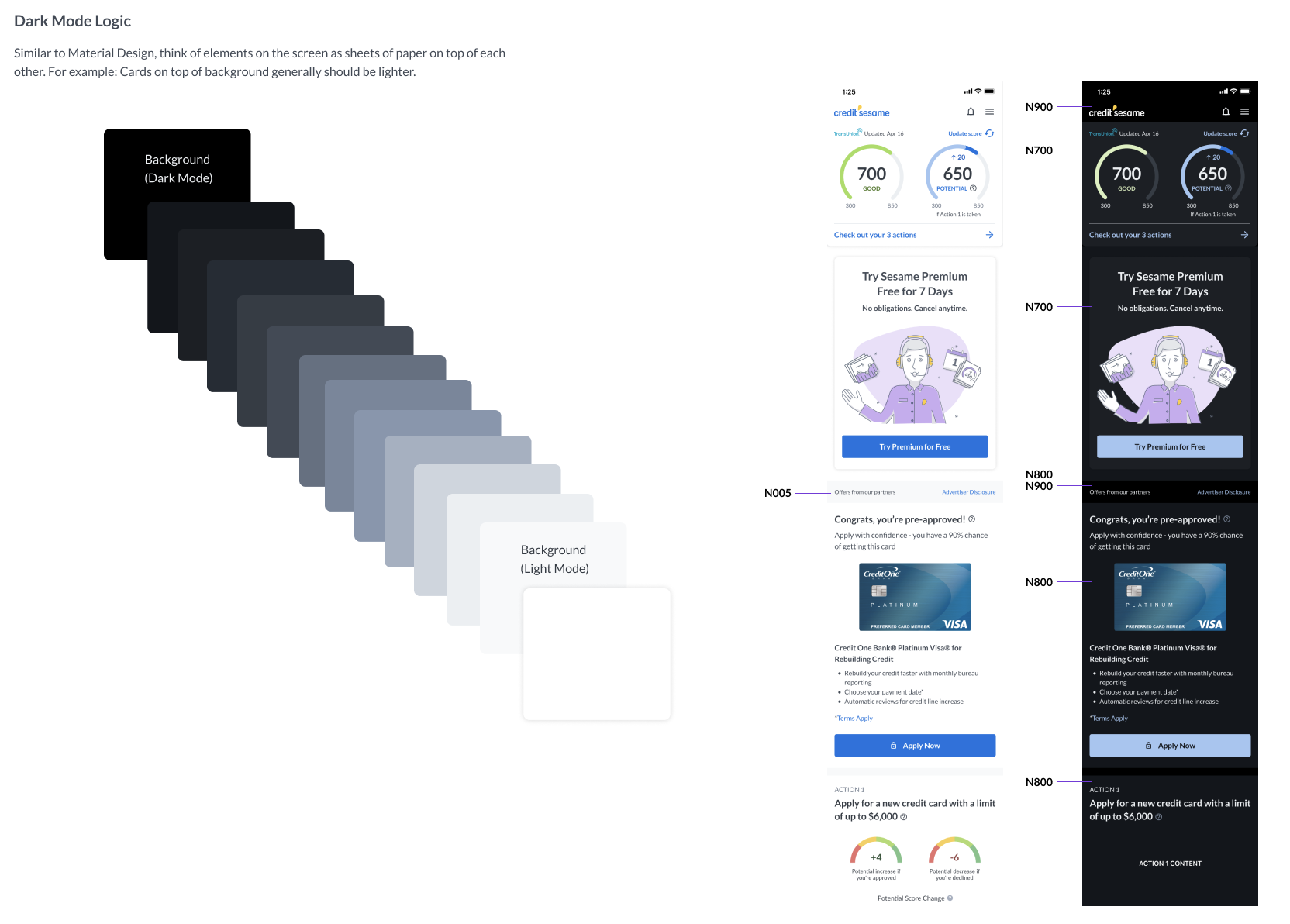
Developed a guide on choosing colors based off how they’re "layered” on top of each other
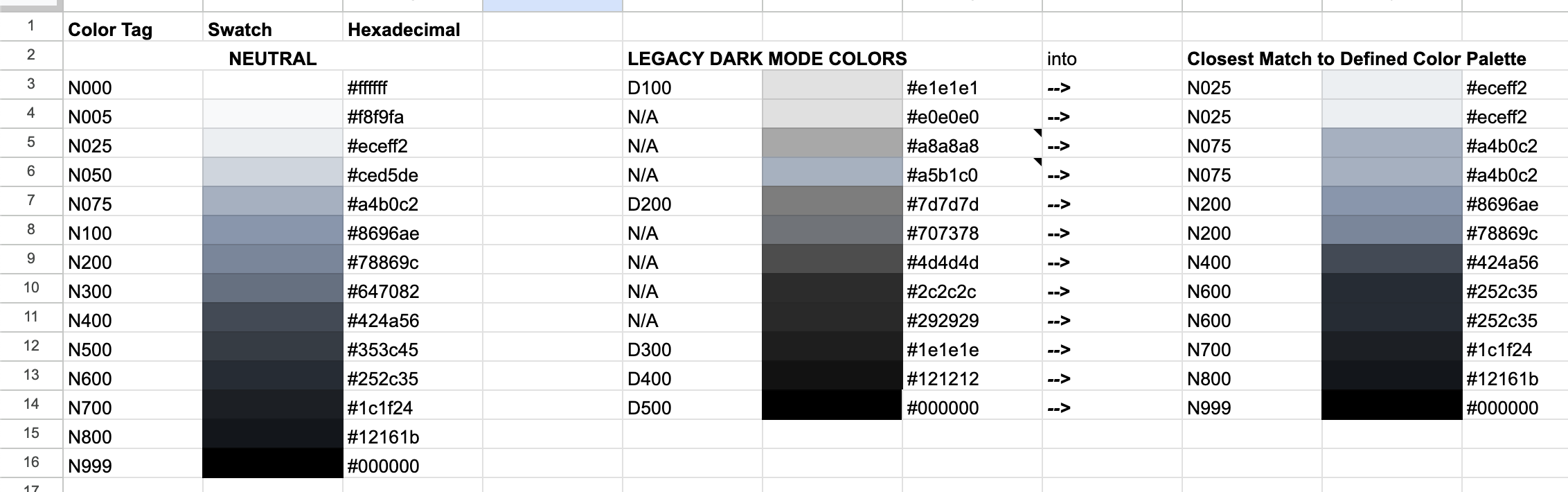
Left: The newly defined Neutral palette. Middle: Colors I found used in Dark Mode that would be retired. Right: Guide on which of those colors correspond to the new one.
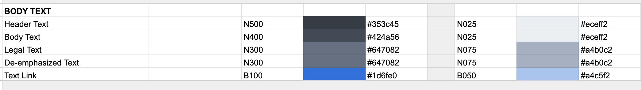
Example of a guide of light-dark color pairings for text.
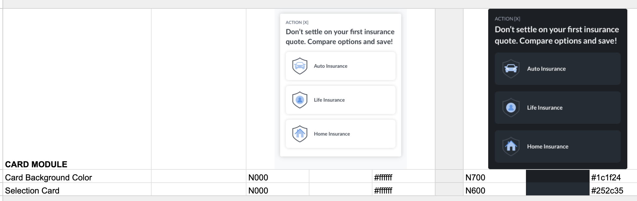
Example of a guide for how to apply the light-dark color pairing for the card component.
A key area that benefited the most was in the Sign Up funnel, which underwent a GLOW UP that increased conversions.
Governance - how do we maintain and contribute?
We leaned toward a federated model of contribution.
One of our Design Directors owned the overall strategic direction, but it was largely self-driven by a small group. 1 designer from 3 different teams came together because we were so passionate about updating the design system. We would have regular meetings each week to talk about what needed work. None of us were experienced in building Design Systems but we wanted to figure it out together.
Additionally, a key developer from the Android, iOS, and Web team were regular partners of working sessions to audit and discuss components. :)
An example of a component I made!
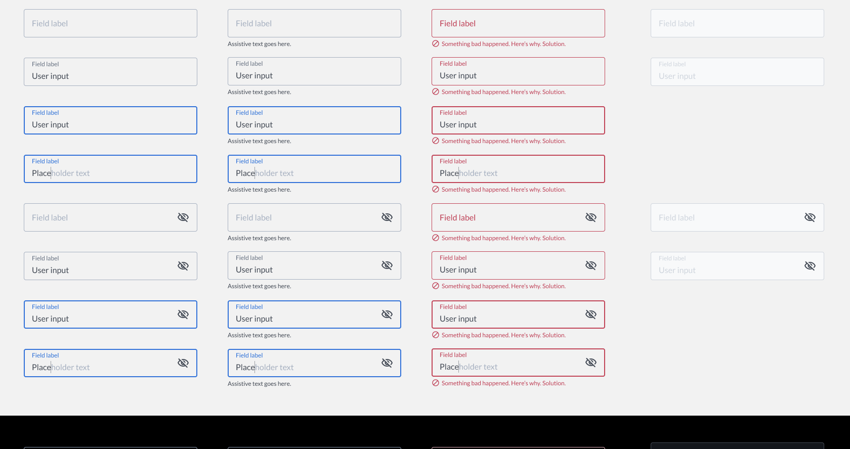
The form field was one of the most commonly used components with thousands of instances. I recreated the component in Figma and expanded the component to add 50+ new variants for placeholder text, visibility toggle, dark mode, and assistive text.
Lessons Learned
Improving the design system at Credit Sesame was one of the most rewarding experiences I’ve ever had. Helping teammates do their work faster and more efficiently is something that I really enjoyed.
When there are components that need to be updated, attach the work to a team’s project that already uses that component. Without a dedicated Design System team, we needed to be strategic about prioritizing components and how they get updated.
Not everyone will follow standards even if it exists. Striking the balance of serving the team vs. upholding standards can be tricky.
Developers are key partners to being a part of design system talks. Including them shows that we care about doing things that help everyone.