
Credit Sesame is a personal finance company allows people to check their credit score for free, and also offers online banking and services to improve their credit score. At the time in 2021, over 9 million users had signed up on the platform. Now, it’s at over 16 million.
🤔 Problem
The partner that brought the highest-converting traffic to Credit Sesame wanted a higher conversion rate within 3 months to continue the partnership with Credit Sesame. The project was to find a way to improve the conversion rate of customers coming from articles written the partner’s website. However, Credit Sesame’s experiments so far performed worse than the control.
How might we find out what will really work to bring in new customers?
💪 Role & Contributions
I was the sole designer working with on the Sign Up Team. I collaborated with the Product Manager on the team as well as the Content Strategist from the Marketing Team.
I created mockups, visual design, illustration, and conduct user studies to gather feedback from potential customers.
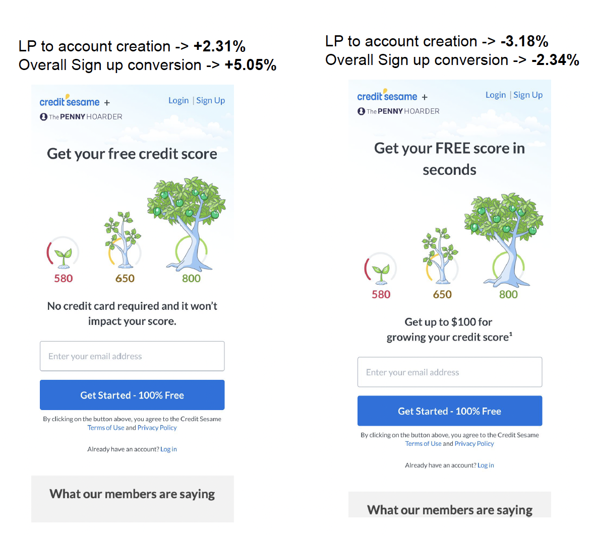
🌟 Impact
The improved landing page increased landing page-to-account creation by 2.31% and overall sign up conversion by +5.05% within the first week. For a company that has visibility on thousands of potential customers every week, it was significant - and it brought hope.
Following budding intuition
As we weren’t succeeding, I had a hunch that it might take more than updated copy and a simple graphic to get the results that we wanted. I put together a research study to run a qualitative A/B test with 10 participants total. I defined the goals, wrote the script, ran the tests, and watched the feedback.
What I got was a goldmine of feedback.
Feedback on the copy of earning money
Aspirational imagery
Risk aversion
(Insert feedback)
However, the prioritization of the projects were shuffled, and I no longer had the bandwidth to work on this project… for now.
3 months later, Credit Sesame brought in an external Behavior Economics Consultant to review the landing pages created by both me and the Marketing team so far. His feedback only confirmed the hunch that I had.
Thanks to research study I did months earlier, I knew I had to follow up. I told my Product Manager I had to try something different.
Nurturing the hunch
If people were resonating with the saplings, why not go all out on it?
I created a new hero section of the landing page.
What I wanted to learn was this — what was having impact on potential customers? Was it the written copy, the image, or the rest of the page content?
Again, we used the same control.
Control
Variant 1
Variant 2
The content below the fold exactly the same, but change visual presentation of the hero section above the fold. There would no changes to the written copy whatsoever. This way, we could learn whether the new presentation worked or not.
Learnings—ripe for the picking!
As obvious as it sounds, success takes time to grow. Sometimes we really do need to plant a bunch of stuff first, and then prune what doesn’t work so great and learn from it.
I had an intuitive gut feeling, and supplementing that gut feeling with both qualitative and quantitative data was very powerful.
It really helps stakeholders to hear audio clips of potential customers giving feedback.