
Nintendo Switch Parental Controls help concerned Nintendo Switch owners monitor play time on their console, check up on their console's gameplay, and restrict console features.
Known for their family friendly games and approachable brand, it's no surprise that Nintendo keeps parents' concerns in mind to give better playtime structure to their children.
Personally, I used the Nintendo Switch app as an activity tracker. As an avid Nintendo Switch owner, I played for 11 hours straight when the game Splatoon 2 released. The only reason I know this is a fact is because the Parental Controls app tracked the time I spent. Since then, I use it as evidence to show others how addicting my favorite game is.
When the opportunity came up to do a case study, I became curious about how the app could be improved.
Within a limited time frame, what were the biggest usability issues that users experienced that I could address?Platform
iPad tablet
Role
guerilla user testingsynthesizing results
mockup ideation
hi-fidelity screen creation
rapid prototyping
Project Details
2 weeks duration
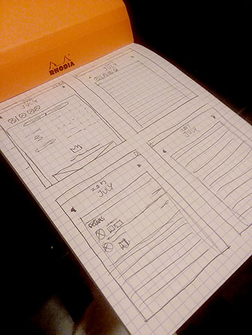
Understanding the problems
My starting point was looking at the review section in the App Store, as actual users of the app leave their honest opinions and feedback there. I used this information to define questions I wanted to ask during the testing phase, where I would physically interview people.
Common comments
Users requested a way to manage different restrictions for families with multiple children, and thus multiple profiles.
Other comments included how users wanted a more thorough log to see more details of specific games played per day.
Preparing for testing
Moving forward, I created objectives to answer during my testing phase:
- How clear is it to find past play history?
- How important is it to have details about what players played months before?
- How useful or limiting is it to have a general restriction across the whole console?
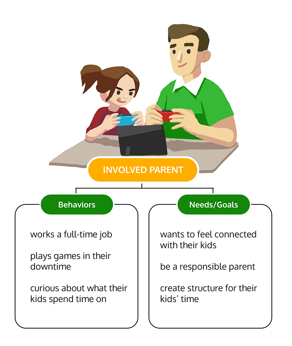
By reading the description of the app, I considered the behavior and needs of the intended target audience and created a proto-persona to guide my design decisions.
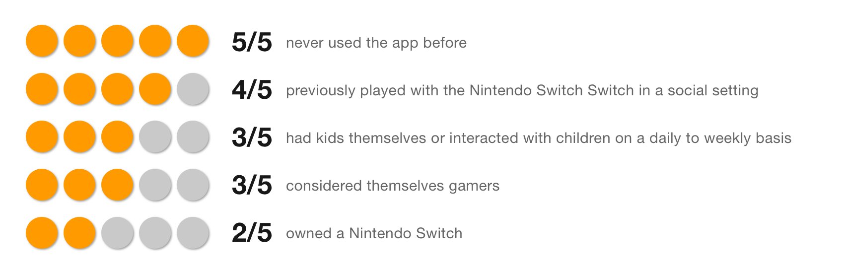
With an idea of who to look for, the next phase was looking for users to guerilla test.
A hiccup in testing...
To find people that fit my persona, I first considered, "Where better place to go than GameStop?"
My assumption was that since GameStop is a well known video game chain store, parents would go there to check out information on the Nintendo Switch, or bring their kids because their children were interested in the Switch.
...However, things didn't go quite as planned.
Partway through the first user interview, I was told by the store manager than I couldn't solicit their customers inside the building.
I respected their wishes and left. Luckily, I was able to interview 1 person who truly fit my persona here.
However, it was getting dark that day, and because the area of town that the Gamestop was in was known for being unsafe at night, I revamped my strategy for my next attempt.
...but managed to pivot!
After getting kicked out from Gamestop, I changed my approach the next day. To respect my time constraints, it was easier to find people willing to do user testing in the park. There, I was able to conduct a total of 4 additional user interviews for a total of 5.
Surprise to solution
Based off of user feedback, there were three areas I decided to address:
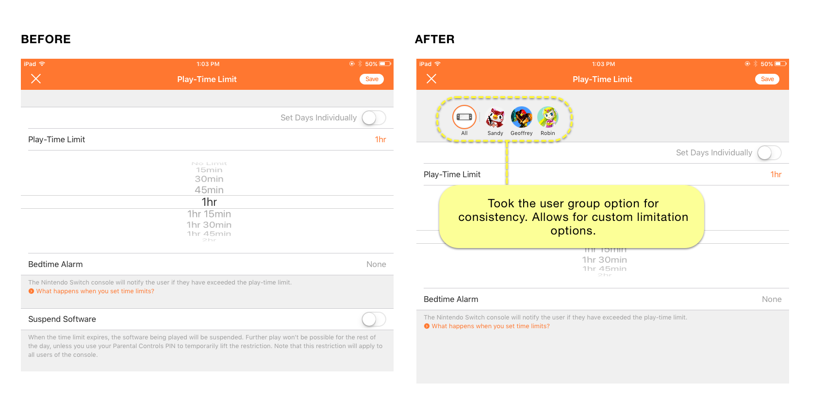
1. Added multiple user profiles to allow the ability to customize restrictions on time limits
When setting time-limit restrictions, users complained that the restricting applied across all users on the Nintendo Switch. I altered the screen to show options of adjusting settings for each user.
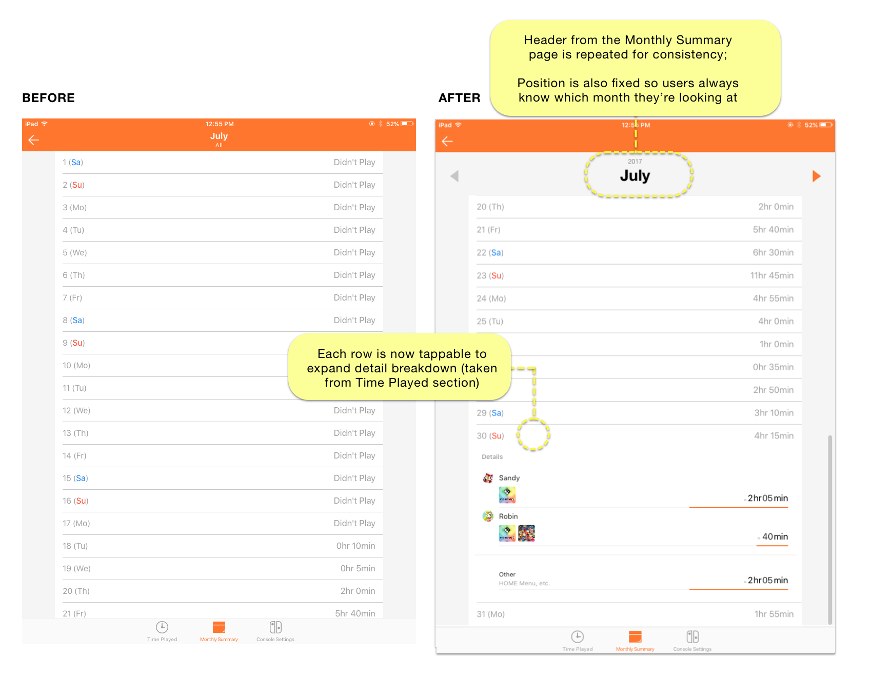
2. Expand the detailed view of play-time so users see what they played on a specific date
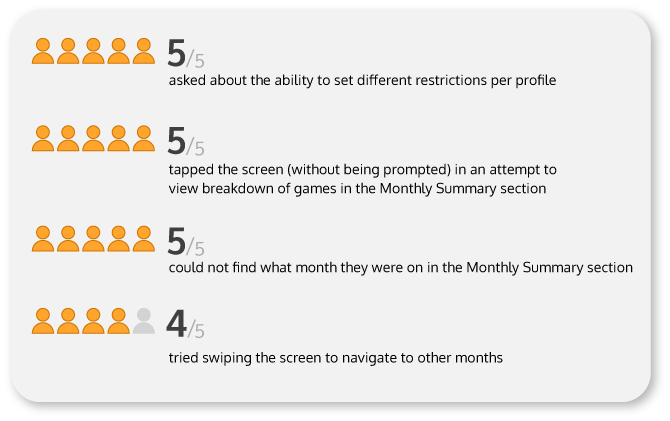
When looking at past play history in the previous dates under the Monthly Summary section, only the total play time was displayed. Details about which game was played, who played it, and for how long were not available.
Users want details to have a better idea of who played what, so I expanded the feature to allow them to check over more thoroughly.
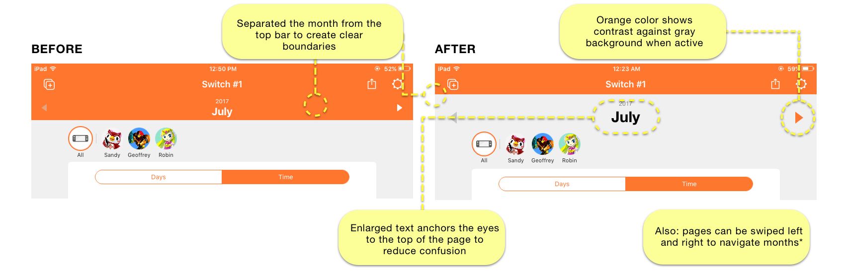
3. Changed the visual hierarchy of the header bar of the Monthly
Though online reviews gave me an idea of what to test for, in-person user testing revealed a surprise: Users simply did not easily understand what month they were looking at when browsing their history iPad.
The reason for that was the white text on the orange header bar didn't stand out, and so they struggled to understand what month they were currently looking at. On the iPhone version, the text of the month is clearly differentiated.
This is valuable usability feedback that I could have overlooked had I not tested users in real-time.
Prototype
TAKEAWAYS
Guerilla testing challenged my comfort zone
As an empathetic person sensitive to making others feel uncomfortable, approaching strangers on the street for guerilla testing was one of the most challenging things I did on this project. For the sake of making a greater products, it's important to learn how stretch beyond what we're comfortable with to get actionable insights.
Live user testing always challenges usability assumptions
Because of my own familiarity with the app, I didn't have the exactly the same UI issues that first-time users struggled with. This is something I never would have known without testing.
Happy Switching!